As Media Studies
Blog & Evaluation – music (Front cover) – week 9
I created my front cover by using Photoshop and in design. Photoshop was used to crop my pictures; it was basically the base of my how I created my front cover, I then used in design to put together all the element of the magazine.
My magazine uses the same head titles, sub titles and captions as any other house magazine. The head title is always the biggest and most visible word on the front cover, it is bold and it stands out, enabling the audience to know what exactly the magazine is about and what it is called. Below is an example of two funky house magazines;
These magazines come from the same genre however they are split up into different sections of the genres; therefore I have decided to develop some of the things that are used in both magazines such as using contrasting and bright colours. However, I have also challenged the forms of house magazines by using proper images. In contrast to the magazines, I have decided to use an image of a real life person, as I believe it brings the page to life and makes it much more interesting.
This is the outcome of my front cover, it uses the basic components of an average house magazine as seen in my research but also other components have been added onto the magazine to make it more eye catching and relate to its genre better. The genre is house, but as there are many different types of house, I have decided to do ‘funky house’ the term funky can be illustrated through the use of many different bright colours, hence the reason why I have used a mixture of colours to show this.
My product has a representation of a D1/D2 social group – those who are still in education. It is preferably aimed at youths and young adults, an age range of 15 – 21. Within my front cover I have used a range of different colours which makes the magazine eye catchy, in comparison to a normal house magazine, it is brighter, bolder and it looks interesting, rather than dull with very few bright colours. It also has an image on it which will instantly appeal to the eye rather than any other magazine.
A media institution is an established, often-profit based organization that deals in the creation and distribution of advertising, entertainment and information services. Hence, the publisher that I would use to publish my magazine would be IPC Media.
IPC Media produces over 60 iconic media brands, with print alone reaching almost two thirds of UK women and 42% of UK men – almost 26 million UK people – while our websites collectively reach over 14 million users every month.
The reason for this is that they are one of the leading media institutions in the UK, and also they produce the top music magazines as well as a variety of other magazines.
IPC Media is a very well known publisher, 26 million people in the UK read a magazine published by IPC Media by which my target audience of youth s and young adults cover up to 30% of this, therefore by using them to publish my magazine I will definitely know that they will be doing a good job and that my magazine will be read weekly with a high rte of youths and young adults increasing up the figured. In addition, because they are such a big and well known company, there should be more advertisement options as it should be both easier and cheaper to advertise with help from such a big media institution.
The target audience is for youths and young adults, between the ages of 15 – 21. I have chosen this as my target group because as based on my research, funky house is one out of 3 major music types that youths and young adults enjoy listening to. Therefore this will increase the rate of how many people read this magazine. In addition, I would interest more youths as they can find out the latest gossip and new songs based on the genre on music that they enjoy listening to. Also as IPC is one f the leading magazine publishers with the statistics of youths and young adults of 30%, it is guaranteed that this magazine will be the number one selling house magazine.
Blog & Evaluation – music (Front cover) – week 10
My front cover challenges the forms and conventions of a real media product as it uses a range of different bright colours as its background. Most media products have one colour for its background, however by using a range of several colours, the cover suggests the reason for the use of the title ‘funk me’ – in other words the title means funky, using a range of different colours is the best way to identify a funky magazine as this will automatically attract the target audience. In addition funky illustrates a range of various colours; this also suggests why I decided to use this as a title.
The reason why I decided to make the magazine plain was because most magazine that use a lot of colours have less by-lines. Hence, I tried to format my magazine to look like this.
In some ways both magazines are linked. There is a main image that is centre of the page, and it is ahead of the title. There are also by-lines, however the most obvious by-line which is big in don’t is about the picture in the centre of the magazine. For instance, in the ‘Billboard’ magazine, Soulja boy is the main image, hence the main by-line says Soulja boy. In my magazine, Funky Dee is the image and the most obvious by-line says ‘Interview with the one and only Funky Dee’. However it is not very big in font and you wouldn’t notice that it is the main story.
My magazine represents young youths as the target audience is still for youths and young adults, between the ages of 15 – 21, also as the price is quite reasonable, maybe not for young youths but young adults. Also as IPC is one f the leading magazine publishers with the statistics of youths and young adults of 30%, it is guaranteed that this magazine will be the number one selling house magazine. Hence I will still be using IPC to publish my magazines.
The range of colours will continue to attract my target audience, as it relates to a funky vibe, hence the use of many colours.
Blog & Evaluation – music (Front cover) – week 11
I changed my front cover in several ways which made it differ from how it looked like before. I kept some features the same in order to make it still attract my target audience. Here is the old magazine and the new magazine.
In my previous magazine, it was a bit plain compared to the re-edited one that I made. In comparison the new magazine has a completely different title, ‘Skanker’. In the young world of youths this is a type of genre that you would use to name a dancer based on the genre funky house, hence why I used it as a title. In addition, I made the title blend in with the background and genre; I made the writing more visible by making it white and boarding around it with different colours.
I also changed the colour of the by-lines to make it blend in with the background. I also made the main by-line visible, bold. ‘Exclusive interview’ is the boldest font on the page, this instantly attracts the readers eyes towards it by which underneath it, it has the name of the main image, ‘Funky Dee’, this is also one of the boldest font on the page, it also links with the title as it uses a white infill and different colours to board around it.
I change the image of the front cover because I felt that my new image was clearer and matched the genre better. Also the eyes in the image were looking directly at use, in other words I felt that the image was telling the reader to pick up the magazine and read it. This is how I feel it is going to attract my target audience.
I made the price more visible, by the barcode, I done this by making it white. I noticed that because the background was colourful, white was the best colour that made the fonts visible by contrasting with the background. In addition, I made the stroke of the by-lines increase in size; hence the font became more visible and more readable.
In comparison to both of these magazines, my magazine challenges the other as it has more conventions, but also it uses some f the same conventions that the original magazine has. This includes the image in front of the title, the by-lines being on one side, but also o the other side.
I have learnt through technology through the process of constructing my magazine, how to use adobe in design. It was hard to use it at the beginning hence, my magazine looked blunt and dull, though most magazines may look plain they still look attractive whilst on the other hand my magazine before re-editing it look plain and unattractive.
From my preliminary task I felt that I have learnt how to edit my pictures well. I also learnt how to use in design for the first time as when I was doing my preliminary task I was unaware that we were meant to use in design to produce our product so I manage to learn how to use it to re-edit my magazine and make it more attractive, hence, the changes from the magazine before to the magazine after.
Blog & Evaluation – music (Front cover) – week 12
After my presentation, the feedback I got helped me to make final adjustments to my music magazine the feedback I received were; to change the size of the barcode; the barcode was too big in size which differed from other magazines however, it didn’t make the magazine anymore appealing, instead t made it look fake, as no other magazine had a big barcode on the their front cover. I also change the price of the magazine. I dropped it down from £2.49 to £1.29. this was because I received feedback from youths, they claimed that £2.49 was too much of a high price to pay for just a weekly magazine, as a monthly magazine would cost the price that I started off with, and a s youths of a D1/D2 group who do not work, the price is way beyond what they should be expected to pay.
Here is how my new and final magazine now looks like:
I learnt how to use adobe Photoshop and in design properly in order to redesign my magazine. I used adobe Photoshop and in design to create my music magazine. I used Photoshop to create my background, which brought a colourful vibe and was well suited for my genre funky house. I also used Photoshop to edit my min image. My photo had a brick background. I used many different tools to reform my image. I used the polygon tool to get rid of all the excess within the image, then I used the magic want tool to get rid of everything else that was close towards the image, when I done this, I right clicked the selected excess, clicked on feather and changed the feather to the number 2 and clicked enter, after this I pressed the delete button then pressed ‘Ctrl and D’, this cropped the picture properly and made it look nice and neat. On in design I placed the background and image into it on different layers then I begin to place them where I felt the image would be necessary. I made the title on in design using the text tool, I used the swatches bar to change the colour of the writing and I used the stroke tool to increase the font size and make it bolder which made it stand out. I did this with all the text on the page. I put each of them into different layers, this made the workload easier for when I wanted to delete or redesign something as if I did not put them into separate layers it would have been more difficult to redesign m magazine after receiving the feedback.
In comparison to the preliminary task, I learnt how to use in design which was where the preliminary task was meant to be done on, however I failed to do it on that and done it on in design. The cropping and editing of the picture was easy as I was familiar with adobe Photoshop. Creating the magazine on adobe in design wasn’t a hard as I thought it would be, it was actually quite easy to use, however I had to get the hang of it before thing started becoming simpler. In comparison to my preliminary task, I think that i have done much better in terms of creating my magazine to a higher level. My magazine looks more like a normal magazine, however the changes that I have added to it has made my magazine look better and appealing. I think that my target audience will be more interested in the magazine and it will encourage them to buy it, especially as I have changed the price from my feedback, it is now well suited and fits the representation group of young youth, i even changed my target group from 15-21 to 13- 19, this is because this is the average age based around youths that are interested in this genre.
Blog & Evaluation – music (contents page) – week 14
I am designing my contents page to match my front cover, this means that my contents page will use a range of different colours to match the genre; this also means it will match the background of my front cover.
In my research, I managed to find magazines that I decided to format in the same way when creating my magazine. This is the 2 magazines that I manage to research, by which my magazine should use some of the same conventions:
These are the two magazine contents page that I will try to relate my contents page to. They both use a range of colour, especially the 2nd contents page, this will be beneficial towards making my contents page look like appealing.
I will be designing my media product to represent a representation of social groups D1/D2. This is still aimed at my target group which has now changed from young adults to just youths. I think it will be appropriate if I use a lot of images and less writing, because according to my research youths like to look rather than read.
My media product will attract my target group by the use of colours; in addition the font will be bold and colourful so that it is eye catching. The main by line will be the boldest in terms of font and it will also be the most obvious by-line on the page which will attract the reader to read on, hence it will also be the double page spread. The use of colour will be used at every point possible within the contents page, as this will contrast with the front cover in terms of the use of colour.
Blog & Evaluation – music (Contents Page) – week 15
My magazine contents page uses the same conventions as the one shown previous, as it is formatted in the same way; the title is visible at the top, the contents is on one side of the page whilst there are main images at the centre of the page, which suggest that it is well suited for my target audience.
Here is an image of my contents page;
My contents page uses many different colours which contrast with my front cover; in addition it has colourised borders around the images. The majority of the page consists of the colour red, hence I made the main image red which suggests that it is the main story and it is what people will be reading in the double page spread. I decided t leave the background white so that I could use many different colours without it clashing with the background and the two possible colours that I could have used would be white or black. As my theme is a bright theme as it is funky, the best colour was white. Black represents darkness, hence the white background.
I decided to add contact details, because along with my research I used a youth magazine that I fund in the library, it used a range of colours and it matched the genre that I was doing, hence I used it as basecoat, in which I would develop to my contents page.
The front cover and the contents page both link through the use of various and different colours that I used, it attracts my target audience. I learnt how to use in design to design my front cover so I had a clear idea of how I was going to design my contents page. I learnt about technologies whilst constructing my contents page; I learnt how to place borders around images to make it look neater. I didn’t edit any of the images therefore I did not use adobe Photoshop to edit any images. The process of creating the contents page wasn’t as long as the front corer, I would say it was easier in some way, but also hard as I had to be aware of where to place each item and how t make it attractive and contrast with the front cover.
In comparison to my preliminary task, I feel that I have learnt how to make my contents page more attractive whilst make it relate to the front cover. Also, it has more features and unlike my preliminary task I conducted research before progressing onto creating the contents page, this made it easier for me to know what I was doing with the contents page and how it would look.
Blog & Evaluation – music (double page spread) – week 18
I am going to design my double page spread to have relevance to my front cover and contents page. Again, this involves the use of many colours in order to make the double page spread bold and colourful. As my target audience is aimed at youths, my research suggests that they enjoy looking rather than reading, and if they do read they’d rather there wasn’t a lot of writing. Therefore I am going to design my media product with less interview writing, suggesting that the interview gets right to the point. This will attract my target group to read on.
Here are two examples of magazines that I will use as a base coat to what I will continue to develop and form my own double page spread.
I have chosen these two magazines as a layout, rather than for the use of colour. These magazines do not represent my genre, however it does represent what my target audience would be expected to read, hence I will designing my product to have the same layout.
Here is another example of a magazine that I will use as a base coat for the layout of my magazine, it also includes annotations of hat I will using in my magazine to attract my target audience;
I am designing my product to represent a particular social group of D1/D2. This is aimed at youths aged between the ages of 11-19. The target group still stands as this because based on my research, funky house is one out of 3 major music types that youths and young adults enjoy listening to. Therefore this will increase the rate of how many people read this magazine. In addition, I would interest more youths as they can find out the latest gossip and new songs based on the genre on music that they enjoy listening to. Also as IPC is one f the leading magazine publishers with the statistics of youths and young adults of 30%, it is guaranteed that this magazine will be the number one selling house magazine.
I will be attracting my target group with colours, less writing and a large image. This will attract my target group and therefore make more sales, especially if it’s in connection with IPC which is a leading media publishing group.
Blog & Evaluation – music (double page spread) – week 19
I have designed my media product to represent young youths and also what they would expect within a magazine that is aimed at their representation group.
My magazine challenges the forms and conventions of other double page spreads magazines, as in my double page spread I decided to add more colours, hence I changed the background. It is also similar to double page spreads as it uses the same codes such as a main image, a topic title, and the interview.
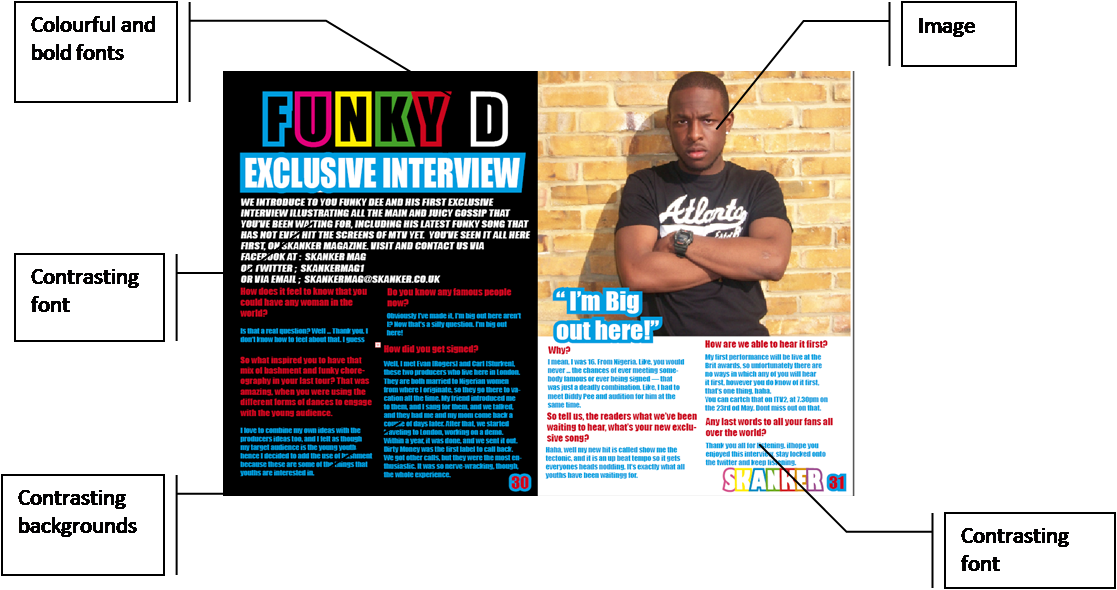
Here is an image of my double page spread;
I decided to use the colour black for the first half of the background of the double page spread, this is because the writing were bright colours, red, blue and white, in order for the contents to be readable I needed a stable background colour which would allow everything to show up, hence the use of black.
I decided to make the title bright in colour, this matched the front cover. They use of colour illustrated my genre and made the [age more appealing over the colour black. I also decided to use the us the colour red for the second half on the page because in my contents page the colour of the border over the main image was red, therefore this suggests that the main story and by-line will be the double page spread.
Below is how the contents page and the double page spread are linked, it also includes annotations as to how it works together;

I learnt how to design my double page spread using in design, it was difficult to set the page to an A3 sheet, but after I got the hang of that creating he double page spread was simple. I edited my images on Photoshop; I didn’t really change much on the images. All I did was crop the unnecessary excess the place it into in design.
In comparison to my preliminary task, I manage to design my media product to suit my target audience. I managed to create different colours that would contrast with other colours whilst also be readable. I used less writing in the double page spread, but also enough so that it gets straight to the point about the exclusive interview which is what the target audience will be eager to read.
In addition I made my contents page and my double page spread link to the front cover as it continued to use the sane colourful effect which brightened up the page and made it look effective. I think my target audience will be attracted because s youths they like a or of colour as my research has proven, hence the use of colour will attract my target audience.


