3. What kind of media institution might distribute your media product and why?
Also as IPC is one f the leading magazine publishers with the statistics of youths and young adults of 30%, it is guaranteed that this magazine will be the number one selling house magazine. Hence I will still be using IPC to publish my magazines.
A media institution is an established, often-profit based organization that deals in the creation and distribution of advertising, entertainment and information services. Hence, the publisher that I would use to publish my magazine would be IPC Media.
IPC Media produces over 60 iconic media brands, with print alone reaching almost two thirds of UK women and 42% of UK men – almost 26 million UK people – while our websites collectively reach over 14 million users every month.
The reason for this is that they are one of the leading media institutions in the UK, and also they produce the top music magazines as well as a variety of other magazines.
IPC Media is a very well known publisher, 26 million people in the UK read a magazine published by IPC Media by which my target audience of youth s and young adults cover up to 30% of this, therefore by using them to publish my magazine I will definitely know that they will be doing a good job and that my magazine will be read weekly with a high rte of youths and young adults increasing up the figured. In addition, because they are such a big and well known company, there should be more advertisement options as it should be both easier and cheaper to advertise with help from such a big media institution. Also as IPC is one f the leading magazine publishers with the statistics of youths and young adults of 30%, it is guaranteed that this magazine will be the number one selling house magazine. Hence I will still be using IPC to publish my magazines.
A media institution is an established, often-profit based organization that deals in the creation and distribution of advertising, entertainment and information services. Hence, the publisher that I would use to publish my magazine would be IPC Media.
IPC Media produces over 60 iconic media brands, with print alone reaching almost two thirds of UK women and 42% of UK men – almost 26 million UK people – while our websites collectively reach over 14 million users every month.
The reason for this is that they are one of the leading media institutions in the UK, and also they produce the top music magazines as well as a variety of other magazines.
IPC Media is a very well known publisher, 26 million people in the UK read a magazine published by IPC Media by which my target audience of youth s and young adults cover up to 30% of this, therefore by using them to publish my magazine I will definitely know that they will be doing a good job and that my magazine will be read weekly with a high rte of youths and young adults increasing up the figured. In addition, because they are such a big and well known company, there should be more advertisement options as it should be both easier and cheaper to advertise with help from such a big media institution.
Also as IPC is one f the leading magazine publishers with the statistics of youths and young adults of 30%, it is guaranteed that this magazine will be the number one selling house magazine. Hence I will still be using IPC to publish my magazines.
A media institution is an established, often-profit based organization that deals in the creation and distribution of advertising, entertainment and information services. Hence, the publisher that I would use to publish my magazine would be IPC Media.
IPC Media produces over 60 iconic media brands, with print alone reaching almost two thirds of UK women and 42% of UK men – almost 26 million UK people – while our websites collectively reach over 14 million users every month.
The reason for this is that they are one of the leading media institutions in the UK, and also they produce the top music magazines as well as a variety of other magazines.
IPC Media is a very well known publisher, 26 million people in the UK read a magazine published by IPC Media by which my target audience of youth s and young adults cover up to 30% of this, therefore by using them to publish my magazine I will definitely know that they will be doing a good job and that my magazine will be read weekly with a high rte of youths and young adults increasing up the figured. In addition, because they are such a big and well known company, there should be more advertisement options as it should be both easier and cheaper to advertise with help from such a big media institution.
4 Who would be the audience for your media product?
.My target audience remains at a representation group of D1/D2, this is because the genre perfectly matches young youths and also the price is beneficial towards them as the magazine is a weekly issue. After receiving my feedback I managed to drop my price from £2.49 to £1.29. I done this because my target audience are youths ages 11-19 a representation group of D1/D2 and classified under the no-working class category. The price was quite high for a weekly issue and especially as it is not aimed at a working-class audience the price was beyond what was expected. Hence, I decided to deduct off the price into making it a reasonable price that my target audience is capable of paying.
My target audience for my media product will be aged 11-19. This is because my product is aimed at the younger generation which is the youths of today. They will be more attracted to the magazine because it is bright which is eye catching and appealing. My media product uses a range of colours and its contents suggests things that youths will be interested in relate, it also relates to youths because it is a youthful magazine. My research suggested that the majority of youths both male and female enjoy looking at things that attract them, this includes colour, font and imaged. My products consist of all three of these.
The research in which I have done based on my target audience which is young people aged around the ages of 11-19 has benefited me into designing the media product. The double page spread links to the target audience because it varies in the use of colour which attracts the target audience.
My research proves that the majority of the young generation prefer products that are bright and have a lot of colour. They enjoy looking at products rather than reading it however, if the product is eye-catching and appealing it pushes them into wanting to read them magazine as well, hence I attempted to do this, however I kept the interview short so that they do not get put off the size and amount of the font.
5. How did you attract/address your audience?
I attracted my target audience by using various bright colours. My target group are youths and my research illustrate that youths are fond of colours. I decided to use many different colours as background settings to make the front cover eye-catching.
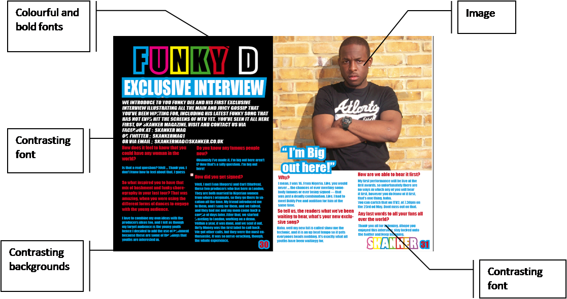
I made sure that the image I took was facing directly at us; this will attract the readers to want to read on about the character at the front of the music magazine.
I purposely chose this photo out of all the other photos I took because the facial expression showed a serious vibe, which contrasted with my genre I done this so that the target audiences will be aware of the double page spread not just being about one topic but also many others.

I also decided to make everything else on the page full of colour, this includes the by-lines. I used different layers when producing this according to the by-lines, image, background, title etc.
My product attracts my target group with the use of colour, font and images. Here is an annotated image of my contents page and how it attracts my target audience to it:

The use of the colourful borders around the image make the images stand out and make it more appealing, it also adds more colour to the page and makes it relate to the theme of the magazine. In addition it is eye catchy.
The reason why the background is white is so that the rest of the images, the font and every other layer that is visible on the contents page can contrast with it. It also allows the page to stay bright and match the theme of funky house which recommends the expectation of a colourful surrounding. The use of the red links the contents page with the double page spread because it borders around the main image and it is the most common colour used throughout the contents page spread.
My media product appeals to my target group as it uses a range of colours. I purposely used a white and black background because they are contrasting colours towards the effect of using lots of different colours to relate to the theme; ‘funky house’.
Though the double page spread is the least attractive out of all three components, it is still attractive on its own s it used a variety of colours to contrast with the black and white background.

He uses of the contrasting colours against the white and black background makes the interview stand out. It attracts the target audience into looking at the page and the slowly being drawn in to read its contents.
I used variety of my different colours; however the main colours are red, blue and white. I used blue and red s the interview colours, because red was the colour commonly used throughout the front cover and contents page which suggested what the double page spread was going to be about, this also link all three components together. I used the colour blue because it was bright and it stood out the most in comparison to the other colours. It also went nicely with white to make the page more appealing, so I decided to combine these three elements as the main colours on my page for the interview. This appeals to the target audience.
6. What have you learnt about technologies from the process of constructing this product?
I learnt how to use the different tools in in-design to design my product. I leant how to use the swatch tool to add colour to my product. I also learnt how to use the layer tool to make sure that everything was placed well and so that if there were any mistakes it would be easier to correct them.
Here are some of the steps that I used into creating the front cover magazine;
These are all the different layers that I used to make sure that my product was neatly kept, suggesting that it was easy to make adjustments to my magazine after receiving feedback. I was familiar at this point with adobe in design so it was quite easy to put everything together in place.
The layers consisted of different coloured lines which helped me to understand what layer I was focusing on.
In addition there was a lock bar on each layer and eye which would either freeze or make the layer temporary disappear so that I could see how my product will look like without the layer there.
made my media product using Photoshop and in design. I used in design to created my contents page. Here are the steps as follows as to how I made it;
I used each of these three tools to create my magazine contents page. I used the swatches tool to add colour to my product. I was familiar with how to do this as I have already done so in my front cover magazine.
I used the layer tool to put everything into order neatly. I also helped me when I was re-editing my contents page after receiving feedback; this made the job easier and made the process consistent and fluent.
I used the stroke tool to make the writing thicker and bolder so that the main headlines were visible. This made the contents page stand out in comparison to the front cover, but it also linked together.
Through the use of adobe in design, I created my double page spread. This was different though I was familiar with adobe in design; however I had to create a double page rather than two spate pages together. I did some research into knowing how to perform this act.
I then I created the page I began to design my double page spread:

I used the same tools that I used for the front over and the contents page, this involves the swatches tool, the layer tool and the stroke tool in order to design my product that will appeal to my target audience. I used these tools to design the font, the colours on the page and the interview itself.
Here is how I used each tool witch annotations:

7. Looking back at your preliminary task, what do you feel you have learnt in the progression from it to the full product?
In comparison to the preliminary task, I felt that I have learnt how to use adobe Photoshop and in design fluently into creating a magazine that matches the genre fitted.
In my preliminary task I was unaware of how to use adobe in design therefore before making my front cover magazine I had to research how to use the tools in order to make my magazine properly. I wasn’t very familiar with it at the beginning hence why I made a lot of changes to my magazine. However, when I got used to it, it was easier than it looked, it helped me to conduct a neat and appealing magazine by which attracts its targets audience and fits its genre.
Looking back at my preliminary task, I believe that I have learnt many different things by using in design. I believe my feedback has pushed me into making my contents page eye catching and attractive which will benefit me and my target audience. I have learnt through my research what youths are more likely to be interested in and how if benefits them.
My preliminary task was very plain in comparison to my music magazine. I also learnt how to make my front cover and my contents page link together in order to make the magazine make sense.
I felt that I have learnt overall how to creating a music magazine that will attract my target audience. I have learnt how to use the components of adobe Photoshop and in design to creating the necessary elements needed to form a magazine.
In comparison to my preliminary task I felt that I have come a long way. I feel that I have made a massive improvement to my knowledge on how a magazine will look in terms of being attractive and appealing toward the target audience that I am aiming to sell my product to.
I have learnt how to put components together to make the magazine benefit those who I have targeted.
In this case I had done some research, unlike the preliminary task, which I went straight onto making the magazine. However I managed to research on the music magazine and find out things that will attract them and what will help my product sell.


